Rebranding should simplify and strengthen a product’s identity, not confuse loyal users with unnecessary changes.
Microsoft has done it again—unveiled a rebranding move that leaves users and critics alike scratching their heads. The legendary Microsoft Office, a name synonymous with productivity for decades, has once more undergone a transformation. But this time, instead of sparking excitement, the rebrand has fueled frustration, confusion, and debate. Welcome to the era of Microsoft Copilot 365.
In this blog, we’ll delve deep into why this rebrand might just take the crown for the year’s most perplexing branding decision. We’ll analyze the implications for Microsoft, the impact on users, and offer insights for businesses to avoid falling into the same trap. Stick around to see how MyceliumWeb can help you craft branding strategies that inspire clarity and trust, not bewilderment.
The Long Goodbye to Microsoft Office
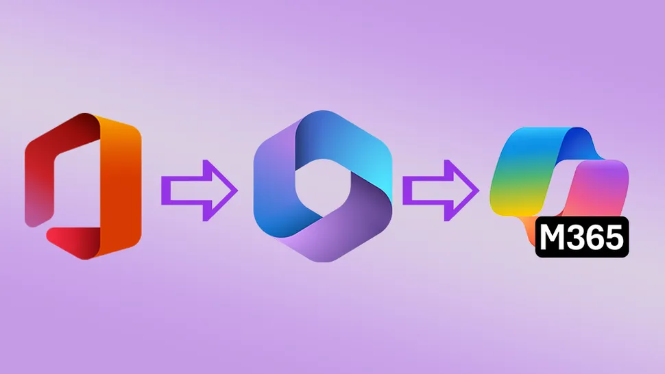
For many, the name Microsoft Office evokes familiarity, reliability, and decades of trust. It’s a household name that has weathered countless iterations, from Office 95 to Office 2019. However, in 2022, Microsoft decided to retire this iconic name in favor of Microsoft 365, a move that puzzled users but was largely tolerated. Fast forward to today, and the company has doubled down on its rebranding efforts, pushing the suite under the umbrella of Microsoft Copilot 365.
What makes this transition so jarring is not just the name change but the complete abandonment of the Office identity. The rebrand ostensibly aims to highlight the integration of AI capabilities, yet for many users, this shift feels unnecessary, especially since the AI features are still in their early stages. While Microsoft tries to position Copilot 365 as the future of productivity, users are left wondering: Why fix what wasn’t broken?
What’s the Deal with Microsoft Copilot 365?
A Case of Logo Confusion
One of the most baffling aspects of this rebrand is the logo design. The new Microsoft Copilot 365 logo looks nearly identical to the existing icon for Microsoft’s Copilot AI chatbot. The only distinction? A small “M365” label slapped onto the Copilot 365 icon. This subtle difference does little to help users quickly identify the app they’re looking for.
Logos are more than just visuals—they serve as vital signposts that guide users. Imagine being in a rush to open Word or Excel, only to mistakenly launch the AI chatbot instead. Such a frustrating experience could have been easily avoided with a more distinct design. Microsoft could have drawn lessons from Google, which faced similar backlash for its overly uniform app icons. Clear, distinguishable branding isn’t just a design preference—it’s a usability necessity.
Is AI Worth the Hype?
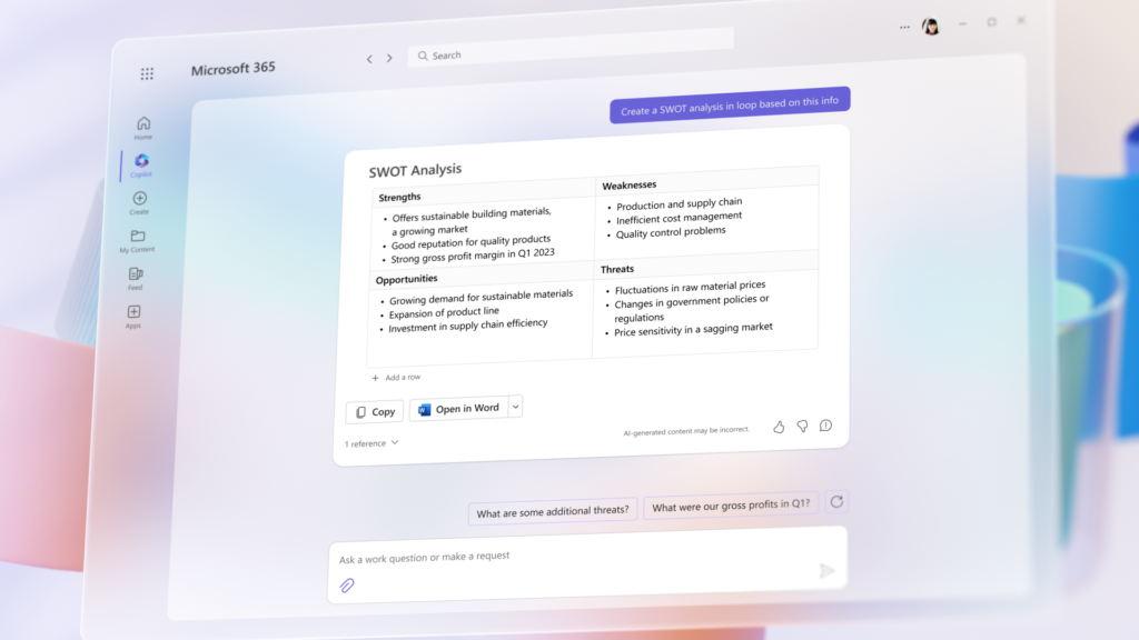
Microsoft’s decision to center its branding around Copilot AI raises an important question: Is the AI integration compelling enough to justify such a drastic shift? For now, the answer seems to be a resounding “no.”
- Price hikes: Users have voiced concerns about increased subscription costs, with many arguing that the added features don’t justify the higher prices.
- Underwhelming functionality: Early adopters describe Copilot AI as a glorified, modern-day version of Clippy, Microsoft’s infamous virtual assistant from the ’90s. Far from being revolutionary, the AI feels half-baked, offering features that don’t significantly enhance the Office experience.
The decision to rebrand around AI seems more like a marketing ploy than a reflection of substantial innovation. By emphasizing Copilot, Microsoft risks alienating users who value the practicality and familiarity of the Office suite.
(Image credit: Microsoft / Future)
The Branding Missteps That Make Microsoft Office’s Rebrand So Problematic
Lessons from Microsoft’s Past Blunders
Microsoft has a track record of rebrands that leave users scratching their heads. Consider these examples:
- Xbox Series X: The name caused widespread confusion due to its similarity to Xbox One X, making it difficult for users to differentiate between the consoles.
- Microsoft Start: The company’s attempt to rebrand the MSN web portal was short-lived, proving that some names are better left unchanged.
- Windows App: Renaming Microsoft Remote Desktop to Windows App added no clarity, leaving users frustrated and confused.
The common thread in these examples is a lack of user-focused thinking. A strong brand evolves with its audience, but Microsoft’s rebranding efforts often feel out of touch, prioritizing corporate objectives over user convenience.
The Danger of Overextending a Brand Name
The decision to slap the Copilot name onto multiple products could have unintended consequences. By aligning its productivity suite with its AI chatbot, Microsoft risks tarnishing the reputation of its more reliable offerings. If users perceive Copilot AI as underwhelming or gimmicky, that negativity could spill over to products like Word, Excel, and PowerPoint.
Jez Cordon of Windows Central highlights this concern, warning that Microsoft’s entire ecosystem could suffer if Copilot fails to deliver on its promises. This underscores a critical branding principle: When you tie everything to one product, the success—or failure—of that product affects your entire brand.
Why This Matters for Businesses
Rebranding is a powerful tool, but it’s a double-edged sword. When done right, it can rejuvenate a product’s image and capture new audiences. But when mishandled, it can alienate loyal customers and create unnecessary confusion. The Microsoft Office rebrand offers several lessons for businesses:
- Customer Clarity: Avoid confusing names and logos. Your audience should immediately understand what your product is and how it benefits them.
- Highlight Genuine Value: A rebrand should reflect meaningful improvements, not just cosmetic changes.
- Test Before Launching: Market testing can help identify potential pain points and gather feedback before a rebrand goes public.
At MyceliumWeb, we specialize in helping businesses navigate the complexities of rebranding. From strategic planning to design execution, we ensure that your new identity resonates with your audience while preserving brand equity.
Read more about innovative AI applications, such as in language learning with Duolingo, to inspire your business’s approach to technological integration: Duolingo and AI in Language Learning.
Is Microsoft Losing Its Identity?
The Microsoft Office rebrand raises a broader question about Microsoft’s brand strategy: Is the company prioritizing innovation at the expense of its identity?
- The name Microsoft Office carries decades of goodwill and recognition. By discarding it, Microsoft risks alienating loyal users who value the familiarity and reliability of the brand.
- The transition to Copilot 365 feels rushed and overly reliant on AI hype, especially given the lackluster reception of Copilot’s features.
- Coupled with confusing logos and inconsistent branding decisions, Microsoft seems to be gambling with its reputation for the sake of being seen as cutting-edge.
This approach could backfire if users begin associating the rebrand with frustration and unmet expectations. For businesses, the takeaway is clear: A successful rebrand requires careful planning, user-centered design, and a deep understanding of audience needs.

The Role of SEO and Accessibility in Branding
One of the most glaring oversights in Microsoft’s rebrand is its impact on searchability. Despite the name change, millions of people continue to search for “Microsoft Office” online. By abandoning this keyword, Microsoft risks losing valuable organic traffic.
At MyceliumWeb, we recognize the importance of aligning branding with SEO best practices. A strong brand isn’t just memorable—it’s also easy to find online. Here’s how businesses can ensure their rebrands are SEO-friendly:
- Preserve Legacy Keywords: Maintain connections to familiar terms that users already associate with your brand.
- Optimize for Discoverability: Use clear, relevant language in product names and descriptions.
- Leverage User Feedback: Listen to your audience to understand how they search for and interact with your brand.
The Final Word: An Unnecessary Rebrand?
Microsoft’s decision to retire the Microsoft Office name in favor of Copilot 365 feels like a misstep. Instead of simplifying its product ecosystem, the rebrand has added layers of confusion, leaving users frustrated and skeptical. For businesses, the lesson is clear: Rebranding should clarify and strengthen your message, not muddy the waters.
MyceliumWeb: Your Partner in Clear and Effective Branding
Rebranding is a complex process, but with the right guidance, it can unlock new opportunities for your business. At MyceliumWeb, we offer customized branding solutions designed to enhance clarity, trust, and visibility. Whether you’re refreshing your logo or overhauling your entire brand, we’re here to help you make a lasting impression.
Contact us today and let’s build a brand that stands the test of time!